Representing Population Data
After collecting and recording data is maybe difficult to understand a long list or table. It may also be difficult to see any pattern from the table alone. With that said, other ways can be used to show the data collected. Some of these ways are by using bar graphs, divided circles and line graphs. Maps can also be used to show population data for example, dot maps, isopleth maps and choropleth maps.
Bar Graphs
A bar graph can be used to show many type of data. Bar graphs used long or short bars to represent the different values. The bars can either be vertical or horizontal. You can use one bar and divide it up to show different values or you can show a number of bars on one graph. Whichever method you choose, your bars and the chart must be clearly labelled.| Bar Graph showing the student population of SSS 2012-2013 (Xyhansha Samuel). |
Line Graphs
These are often used to show how values changes over a period of time. Instead of bars represent each amount, a line is drawn to join each value. They are useful for showing population growth. The horizontal and vertical axis should be clearly labelled.
 |
| Line Graph showing the population of SSS 2012-2013 (Xyhansha Samuel) |
Divided Circles
Also known as pie charts are useful for showing proportions and percentages. For example, a pie chart can be used to show what percentage of the school’s population is male and female. They show a circle or pie divided up into sections or slices. Any data that can be converted into a percentage can be displayed using a pie chart. Field studies and essays are improved when divided circles are used.
.JPG) |
| Divided Circle showing the male and female population of Room 102 at SSS (Tyrique Francis) |
Population Pyramids
A population pyramid is a bar graph diagram used to show the age gender structure of the population of a country, city or other area. The horizontal axis is divided into either numbers of percentages. There is a central vertical axis divided in years either by every ten years, every five years or every one year. The lower part of the pyramid shows the younger population while the upper part shows the older group of the population. A pyramid with a broad base shows a young and rapidly growing population. A narrow base shows a stable population with many older people.
 |
| Population Pyramid of Jamaica and Barbados (The Caribbean Environment for CSEC Geography: Mark Wilson) |
Dot Maps
Special maps show how the population are distributed or spread over an area. A dot map is simplest map we can use to illustrate this concept. Each dot represents a certain value. For example, on a map of the world we can put dots to show how the world’s population is distributed. Ideally the dot will be where the population is located. This means that densely packed dots shows a high density of population.
 |
| Dot map of Trinidad (The Caribbean Environment for CSEC Geography: Mark Wilson) |
Choropleth Maps
Another map for showing how a quantity or feature is generally distributed over a given area is called a choropleth map. Choropleth maps normally show averages, or mean, or ratios or percentages rather than symbols representing whole numbers. Choropleth maps are commonly used to show population distribution and density.
 |
| Choropleth map of Jamaica showing the population density. (Geography for CSEC Examinations: Neil Sealey) |
Isopleth Maps
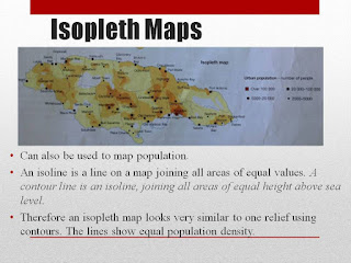
Isopleth maps can also be used to map population. An isoline is a line on a map joining all areas of equal values. A contour line is an isoline, joining all areas of equal height above sea level. Therefore an isopleth map looks very similar to one relief using contours. The lines show equal population density.
 |
| Isopleth map of Jamaica showing the population density. (Geography for CSEC Examination: Neil Sealey) |
.jpg)


No comments:
Post a Comment